The Brief
Walk through any city centre and you can almost predict the colour temperature of the shops before you step inside. Warm grey. Muted sage. Bone. Whatever the season, the palette has been agreed somewhere upstream, and the agreement is that nothing should stand out too much. The look is called a lot of things — quiet, elevated, considered. What it is, mostly, is beige.
The uniformity is not accidental. Trend culture produces this: a legible signal, low-risk, readable at distance. You recognise it, you trust it, you wear it. The problem isn’t that it’s ugly — some of it is well-made. The problem is that it tells you nothing about the person inside it, because it wasn’t designed to. It was designed to circulate.
Personality is not a trend.
It doesn’t come from identifying which version of neutral is current and working backwards from there. The wardrobe that fits a person — their actual formation, their colouring, their pace — starts somewhere else.
I’ve been building that starting-point through personality-mapping, colouring, astrology, and Ayurveda. Some of it AI-assisted — chat sessions that surface what I half-knew but hadn’t named. The output isn’t a capsule wardrobe in any influencer sense. It’s closer to a brief: what this person actually needs rather than what is currently available to need.
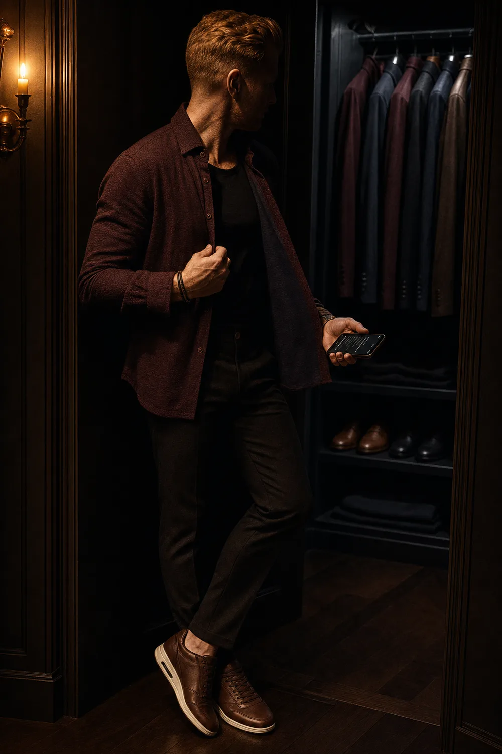
The brief works in layers. Colour first — not ‘what’s flattering’ in the magazine sense, but what the specific constitution can actually hold. Which part of the spectrum is native. What the undertones absorb and what they repel. Where the palette has real range and where it goes flat. That part turns out to be more concrete than you’d expect: you end up knowing that one specific burgundy works and that brighter reds don’t — not because a rule prescribed it, but because the territory has been mapped.
Shape and silhouette come next, and this is where it gets personal. It isn’t about what the body looks like in a photograph. It’s about what comportment looks like when it’s at ease rather than performing ease — the pace, the weight distribution, how presence settles into a room. There’s a real gap between a cut that flatters under studio lighting and one that fits the way you actually move. Accessories follow the same logic: what functions as punctuation rather than decoration, what the hand or wrist or collar can carry without fighting what’s underneath. None of this is abstract once you start looking at it directly.
Texture and finish belong in there too. Whether the constitution leans toward matte or sheen, toward weight or lightness, toward rough or smooth. And branding — which is its own question, less aesthetic than diagnostic: does the label amplify the look, or does it replace the person wearing it? Some marks sit quietly; others announce themselves at the expense of everything else. That distinction, once you see it, becomes impossible to unsee.
Four months in and it isn’t finished. I don’t think it will be — the brief keeps developing as the territory becomes clearer. But it’s been effective in a way the usual approach never quite managed. Working outward from whatever the shops agreed to stock this season was always a negotiation with someone else’s idea of how I ought to present myself. This runs in the opposite direction: start from who I am, and work outward from there. The scope has moved beyond clothing — furniture, objects, the same logic applied without much adjustment. The framework turns out to be portable because the person is the constant.
What it produces isn’t a look. It’s closer to a vocabulary — one with enough room in it to say something, rather than to circulate.
The brief says nothing about beige.